Sunny Side OT
Branding
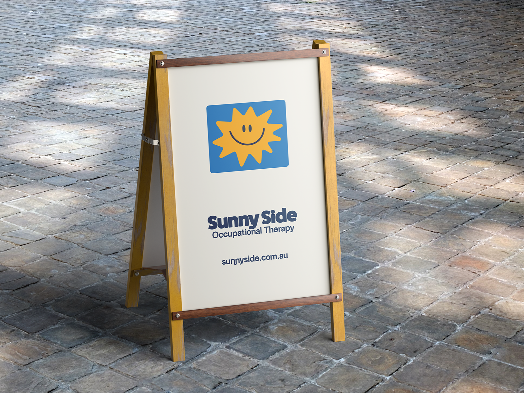
Sunny Side OT approached us seeking a brand identity that felt fun, friendly, and inviting for their new business.
Our goal was to reflect the youthful energy of the founder while appealing to their core audience—young children and their parents. The resulting branding strikes a balance between joy and professionalism, fostering a sense of warmth, community, and trust.
The sun icon was designed to reflect the business name while also representing the heart of Sunny Side’s philosophy. His rays, each a different shape and size, symbolise the uniqueness of every child. Just as no two rays are the same, every client’s journey is individual—and at Sunny Side, support is always tailored to each child’s personal path.